Designing for onscreen viewing.
ASSIGNMENT:
Design an interactive digital booklet featuring typography of one style of the early 20th century
Booklet should have a cover and 4 pages.
Choose one movement:
- Art Nouveau
- Art Deco
- Bauhaus
- Futurism
You should create your booklet keeping a style of a chosen movement
ART NOUVEAU
 Art Nouveau - an international style of art, architecture, and applied art, especially the decorative arts. It was defined by a rebellion against industrial uniformity and was most popular between 1890 and 1910. It is characterized by the ornamental style, with its organic, asymmetrical, intricate and flowing lines. Letterforms mimic natural shapes like flower stems and curling vines.
Core Principles of Art Nouveau Typography
- Calligraphic letterforms rather than geometric construction
- Botanical Integration: Flowers, leaves, roots, and insect wings are plaited directly into the anatomy of the characters
- Unified Composition: Typography, illustration, and borders function as a single living organism.
- Rich Surface Detailing: Display weights often incorporate hairline embellishments and inline strokes.
Typography Characteristics
ART DECO
 Art Deco style was about finding beauty in geometric simplicity, combined with elongated letters and vertical decorative line details. First appearing in the 1920s and 30s, Art Deco made a comeback in the 1970s and 80s as well.
Almost by definition, Art Deco meant sans serif type.
Core Principles of Art Deco Typography
- Geometric Construction
Letterforms are built from rigid, mathematical shapes—straight lines, circles, semicircles, and stepped pyramids—rather than organic, freehand curves. While decorative, true Art Deco relies on sleek editing and clean lines - Verticality and Elongation
Characters feature narrow, towering proportions that draw the eye upward. Typefaces behave like building facades or columns. This mirrors the rising heights of 1920s and 1930s skyscrapers like the Chrysler Building and Empire State Building. - High Stroke Contrast
Heavy, solid vertical or thick strokes intersect dramatically with razor-thin horizontal or accent lines. - Exaggerated Waistlines and Proportions
Crossbars, eyes, and mid-sections in letters (like E, H, B, or R) sit unusually high or low instead of center.
BAUHAUS
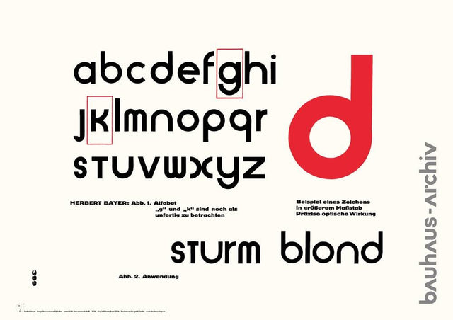 Bauhaus - a German art school operational from 1919 to 1933 that combined crafts and the fine arts. This style emphasized boldness and abstract, yet structured creativity. Bauhaus typography is a modernist design approach that replaced ornate Gothic and serif typefaces with clean, geometric, and functional sans-serif letters.
Core Principles of Bauhaus Typography
- Form follows function: Typefaces prioritized legibility, clarity, and suitability for mass production rather than personal ornamentation.
- Elimination of uppercase: Designers like Herbert Bayer removed capital letters entirely to simplify the alphabet and writing systems.
- Sans-serif shift
- Asymmetrical layout: Layouts featured clear type blocks, strong color contrasts, standardized sizes
for clarity, functional communication, and geometric order (1925)
Video Bauhaus, Short History (2.5 min)
Bauhaus Art and Typography
FUTURISM
 Futurism refers to the radical early 20th-century avant-garde social and artistic movement that originated in Italy in the early 20th century and developed in Russia and to a lesser extent in other countries. It shattered traditional layout rules in art and typography to mimic the speed, noise, chaos of the machine age and restlessness of modern life.
Core Visual Principles
- Noise as Form: Typography was designed to behave like noise, using onomatopoeia and clashing visual rhythms.
- Asymmetric Layouts: Text curved, slanted, exploded across margins, and combined multiple clashing typefaces on a single page.
- Mechanical & Geometric Inspiration: It glorified industrial speed, cars, factories, and urban velocity.
The Bolted Book and typography layout examples
Video Filippo Tommaso Marinetti, poem Zang Tumb Tumb, 1914 (2 min)
A single page from Ardengo Soffici's BÏF§ZF+18, 1915
BOOK PARTS
The booklet contains a cover and 4 pages:
The pages should have (when appropriate): title, subtitle, body copy, images, navigati on from page to page, link to the relevant website(s).

COVER
Put the chosen movement name as the book title, and your name as an author.Although a font face of the book title will be decorative, all typography rules should be applied.
Cover design and book title font can be simple or elaborate, but created in the appropriate style.
Examples of styles:
Art Deco book cover
Bauhaus book cover
Art Nouveau book cover
Futurist book cover
Browse for more examples
PAGE 1
Short history of the movementPAGE 2
Description and specific features of the fonts; use a couple of illustrations with words and lettering.PAGE 3
Brief information about a famous artist associated with your chosen style and an example of his work.PAGE 4
Design in the style of a chosen movement containing typography and some additional elements of that style, if needed.You can fill the page with various words or/and letters, or make a single letter with intricate design, or use the approach of the last project - typographical poster.
Some approximate examples for page 4:
Notes:
- Browse for more examples for inspiration
- If you cannot make a drawing, you can find and download such elements
- If you want to make an additional page, you are welcome to do so
PROCEDURE:
1. RESEARCH
1. Research and gathering materials (dropbox submission):History of the movement,
History of the typefaces,
Information about a famous artists associated with your chosen style and an example of their work.
Useful graphics and elements
2. SKETCHES
Very accurate thumbnail sketches for booklet cover and all pages; not less than 2 sets with different ideas/design/layout.(We will discuss and choose one for the project; this semester we do not have time for the roughs)
Sketch size is not smaller than size 4x3 inches; keep proportions (use rulers)
Example 1
Example 2
Example 3 This one is not too accurate, but shows layout varieties
More examples
3. INDESIGN WORK
Work in InDesign, starting with creating a grid according to your layout.Creating a new document:
- Click on Web tab (800x600px)
- Number of pages: 5
- No facing pages
- No bleed
- The color mode will be set to RGB automatically.
- The measurements will be set as pixels (otherwise go to Preferences>Units and Increments)
InDesign
Use tools, panels and techniques that you learned at the beginning of the semester
Note: don't forget about problems such as missing links and missing fonts; keep the lined image in one folder.
In addition, we will learn:
- Interactive features for the interactivity
- Buttons and Forms panel for actions like opening a new page or playing a video
- Hyperlinks panel so readers can jump to other locations in the same document, or a website.
- Bonus: animation panel for various effects, such as animate text to appear on the page.
Hint:
Ask AI how to create (style of a chosen movement name) layout techniques in software like InDesign or Illustrator
Apply techniques that you find useful for your project
FREE FONTS & IMAGES:
Art Nouveau
Reynold Art Deco
Bauhaus font family
More Bauhaus fonts
Forgotten Futurist
More Futuristic fonts
Also, google: Font Name free font
Google fonts
Google variable fonts
1001 fonts
Dafont
Font Squirrel
Adobe fonts (many variable)
Fontesk
Image by magnific
Poster Archives
Vintage Illustrations & Vectors
Public Domain Collections
General Stock & Vector Sites:
Pixabay, Unsplash, Vecteezy
And more
Important: for the body copy use readable fonts